Here, we'll explain everything that makes up the Workflow dashboard, what it all means, and how you can use that data to drive better business decisions.
Workflow list
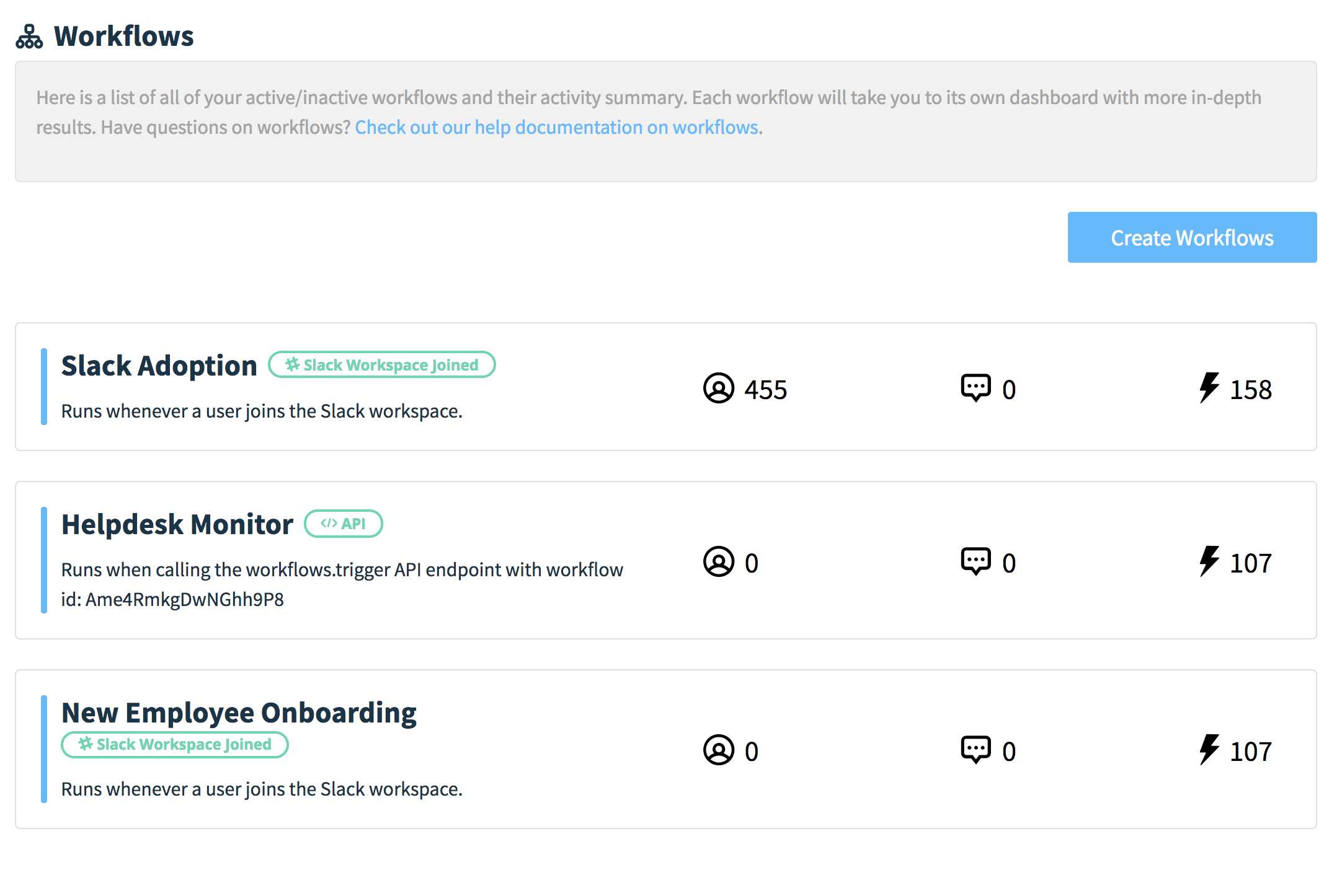
When you head over to your Workflows from the left-hand tab, it will show you the list of all the workflows you have – including active and disabled workflows. From this list, it presents you with a high-level overview of each workflow's engagement:
- Number of responses received
- Number of comments submitted
- Number of times the workflow has been triggered
When you click on any of the workflows, it'll take you to that specific workflow's analytics dashboard, which we'll go over below.
Workflow date range
This is the starting point for your entire Workflow dashboard – everything that you'll see on your Summary Overview and in the tabs, is bound to the specified date-range.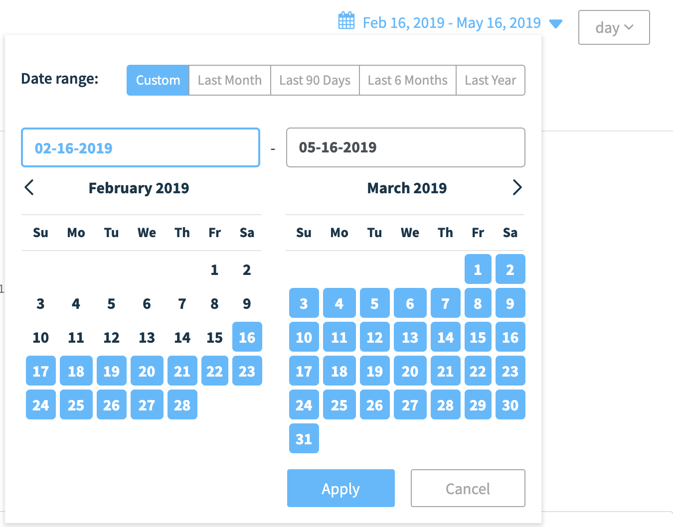
If a date range hasn't been specified for the first time, the dashboard will display everything from the last 3 months until the current date. But you can easily pick a custom date range – such as last week, last month, last quarter, and so on so forth.
By choosing a custom date range, you can look at all of the workflow data that happened in that specific range without all the extra noise, such as the all of new hires that were onboarded last month.
There are also pre-defined date range options:
- Last week
- Last month
- Last 90 days
- Last 6 months
- Last year
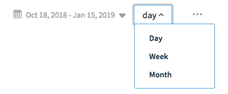
Additionally, you can choose to group your data within the selected range by date, week, or month.
Workflow summary and activity chart
At the top of the workflow overview, you'll see the same summary statistics that are on the workflow list overview: the number of response, comments, and times the workflow has been triggered for the period, as well as any changes compared to the previous period.
This activity overview is based on the grouping within your period — so if your period is for the last month, but it is grouped by day, the activity is for the selected end date versus the last period (yesterday).
You can change the grouping to be by week, or by month, to see how each week compares to the previous within your period.
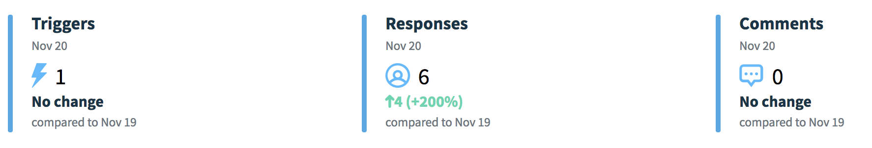
How do you calculate the percentage change vs. last period?
You'll notice that for this dashboard, if you've had any historical data prior to the period, we'll compare this selected range's averages to the period before that (of equal time).
For example: say you averaged an NPS score of 87 this month in September, and the average NPS score for October was 70. We'll show the change as the difference between the two averages, divided by the last average * 100. As a result, this period (September) saw an increase of 24% versus last period (October).
Workflow results summary
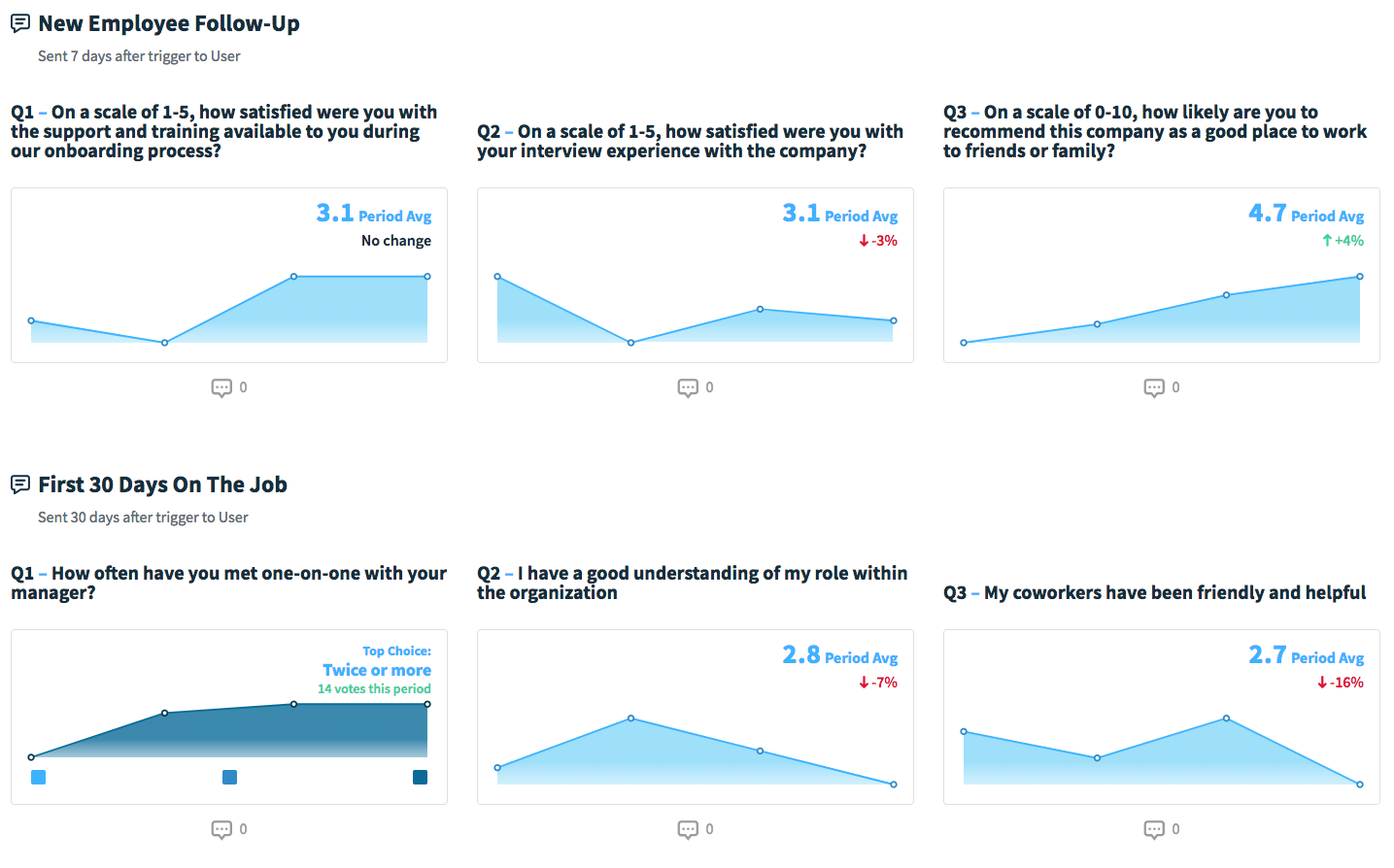
Here is where you'll see a summary of your surveys' results. Since there are so many ways this dashboard could be displayed depending on how many surveys you have, and whether the survey is a multi-question survey or if it's just a single-question poll.
Additionally, your results summary could also look different if you've had more than one instance of historical data (the workflow has only been triggered once) versus if your workflow has been triggered multiple times. We'll go over all the different summary views that you would see on your Results Summary.
You have multiple instances of results
Multiple instances in this circumstance means when your workflow have been running for a little bit and you've collected results from at least two people. With multiple instances, you can see how each person goes through the workflow and answers each question for each survey.
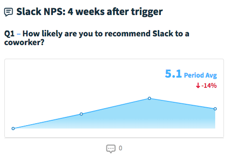
For multiple instances, the data is displayed as a trendline for the results within the selected range.
In the case of numerical question types such as 1-5, 1-10, and NPS, the question summaries will also include the average score for the selected range, comments (if there are any), as well as any changes compared to the previous period.
For text choice questions such as ranked, allocation, multiple choice, and agree/disagree questions, the high-level metric will show either the point leader or the top choice, with the total points or votes accumulated for the top pick. Additionally, you can click on any of the multiple choice options to see just the total votes for that specific option.
You only have one instance of results
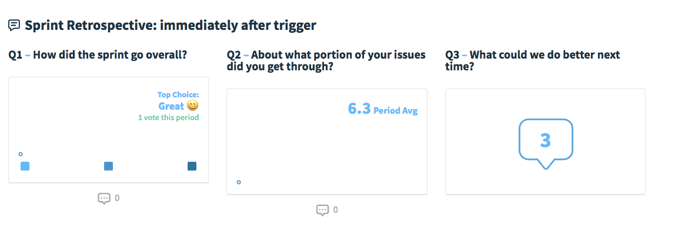
If your workflow has only been triggered once and you don't have much historical data, your results summary will display bar charts similarly to the poll and survey Results Feed, instead of the trendlines you would see if your workflow has been triggered multiple times.
With the exception of NPS and open-ended question types, all of the different question types would display the point leader or the top choice, as well as the number of votes for that top pick. For NPS, it would show the NPS score. Similarly to if you have multiple instances of results, you can click on any of the multiple choice options to see the count of votes for that specific option.
Clicking on a question summary
If you wanted to drill down into a specific question's results, you can do so by clicking on the card in your Results Summary — otherwise referred to as the question detail view.
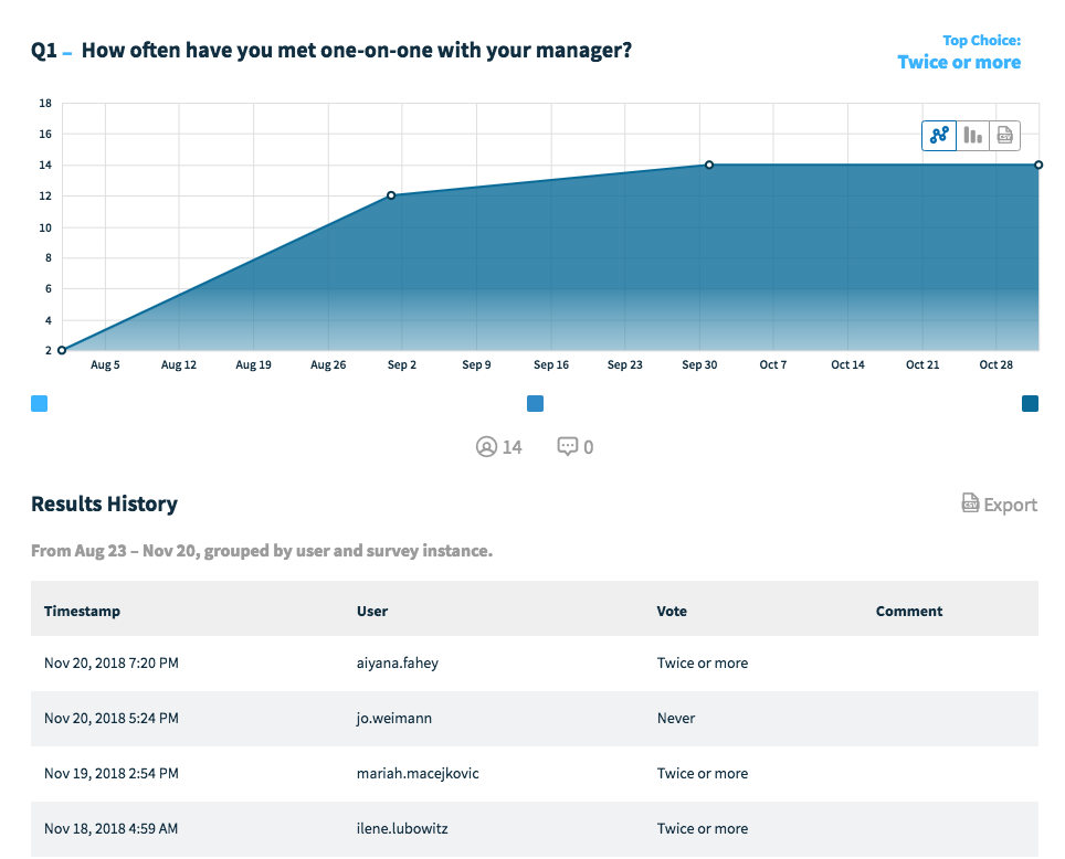
When you click on the question card, it will open up an expanded window that will look similar to what poll details currently looks like.
It shows the same trendline that you see on the Results Summary with the same selected range. Down below is where you can see the Results History for that specific question within the selected range – this will include every user's vote and comment (if any).
Much like any other part within the Workflows dashboard where there's the option to apply a filter, you can filter your results by question, workflow, and demographic metadata (coming soon!).
✏️ Note: When querying the results of a survey workflow, the “Survey Completed” value with a True means that a user hits the submit button, irrespective of how many questions were answered (if there were optional questions)
Workflow Activity Tab
At the top of the page, you’ll see the Trigger Activity chart, which is the number of times your workflow has been triggered over time within the selected range. So here, if your selected range is a month, you will see every time the workflow is kicked off in the selected month.
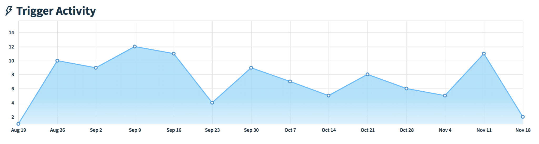
The points will change depending on the grouping of your data: the image above shows the period grouped by week, with each point in the chart for the start of each week. You can change this to be by day, or by month.
Below that is a table of your workflow’s activity in chronological order and the status of each survey. This shows when the last survey was sent out, to whom, and whether it has been completed or is pending completion.
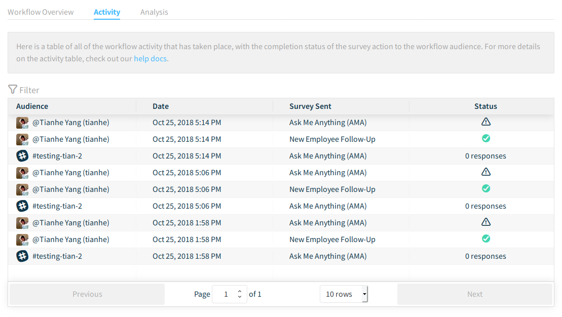
For workflows delivered to the audience via DM, it will have each individual user's status.
And for workflows delivered to a channel, it will count the number of responses collected within that channel.
This information is valuable in knowing where your audience is in terms of their progress within the workflow, especially if it's a multi-survey workflow. For single survey workflows, e.g. approval workflows, you can see the frequency in which the workflow has been kicked off.
Here you'll be able to see a high-level overview of everything that's happened in the workflow, and you can apply filters to see only the data you need. Some examples:
- Everyone in the workflow that has or has not completed a survey
- Filter by a specific survey to see the status of everyone who has been delivered the survey
- Filter by demographic data (such as department or office location) to see where employees within that segment are in the workflow (coming soon!)
- Filter by specific employees to see their status within the workflow (coming soon!)
- and more
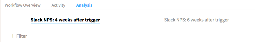
Workflow Analysis Tab
The Analysis tab is where you can dig into each survey's results, and create custom views for your reporting needs.
When you click on the Analysis tab, there will be sub-tabs that break down the workflow by the survey you've set up. For example, if your workflow has 3 surveys, each survey will have its own tab.
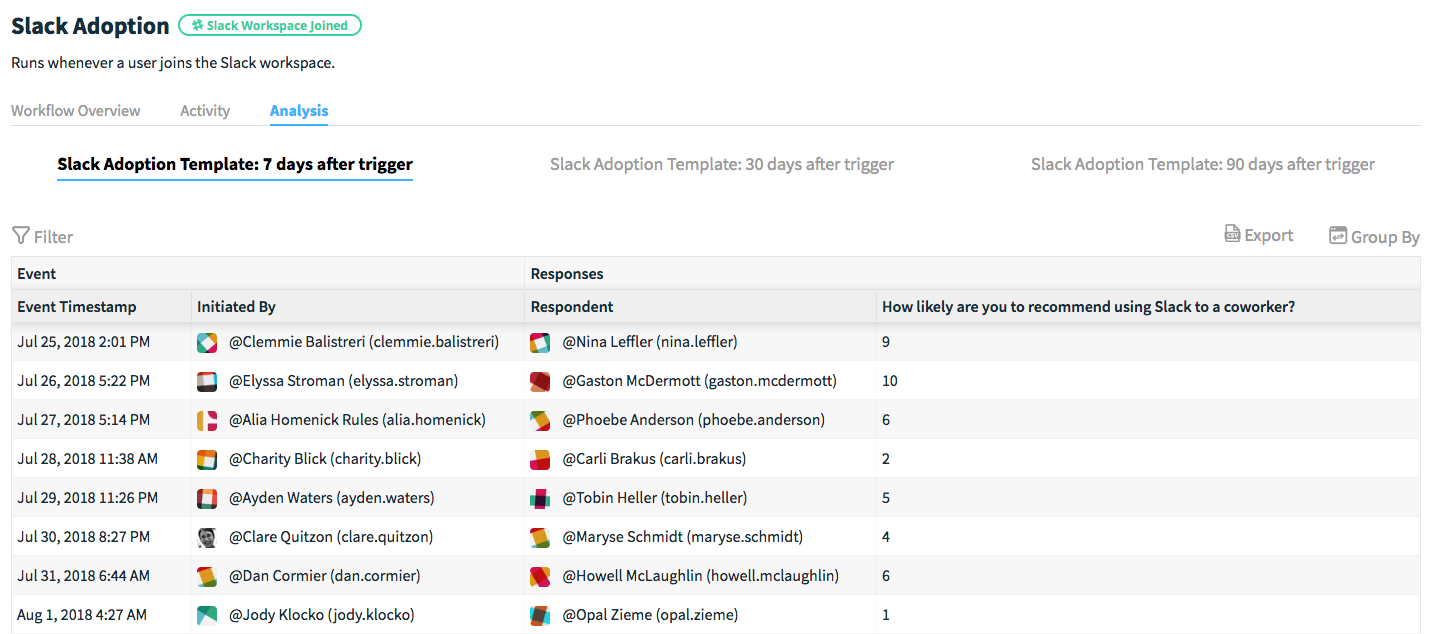
Under each tab will show a table that looks similar to the Activity tab – instead of status, it will show all of the responses in chronological order.
If you have uploaded demographic data, all of your user attributes will be available in the analysis table as well, shown below:
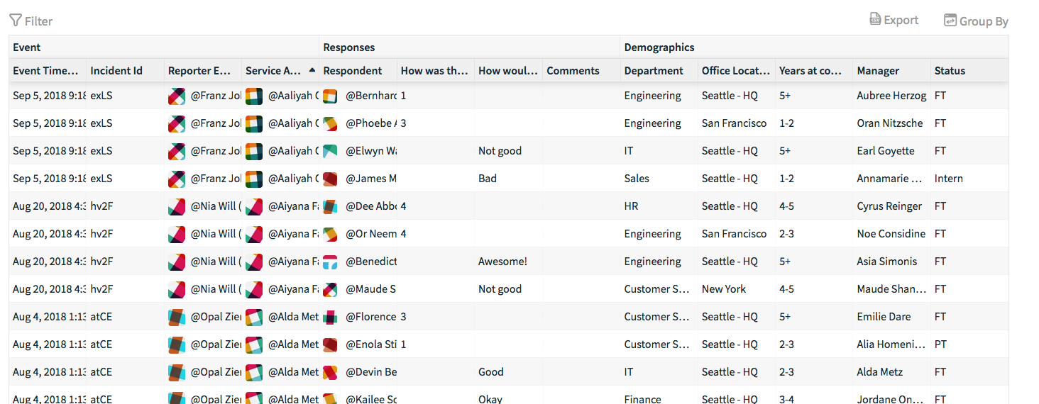
From here, you can create different views of your data by sorting, filtering your results, or grouping your results together by your survey data. You can apply a variety of grouping and filtering combinations to create a view of the data that's most important to you.
Filtering
Sorting
Grouping
Here are some examples of how you create different views of your data tables for analysis:
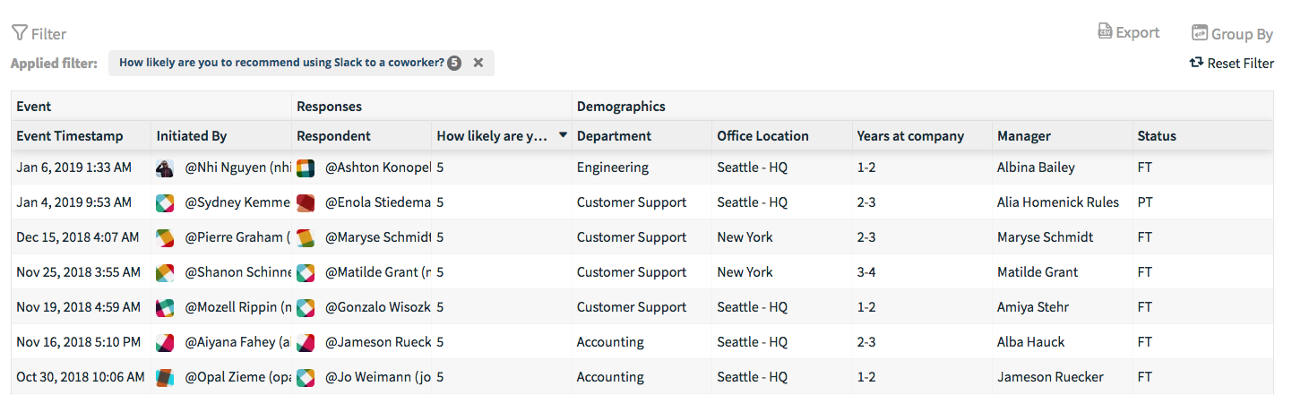
Filter out specific responses to a question – perhaps you only wanted to look at questions that received low scores, or a specific multiple-choice option. In the image below, I've filtered out scores 6 and above, so I can see who scored 5 and lower, and sorted it to descend from 5-0.
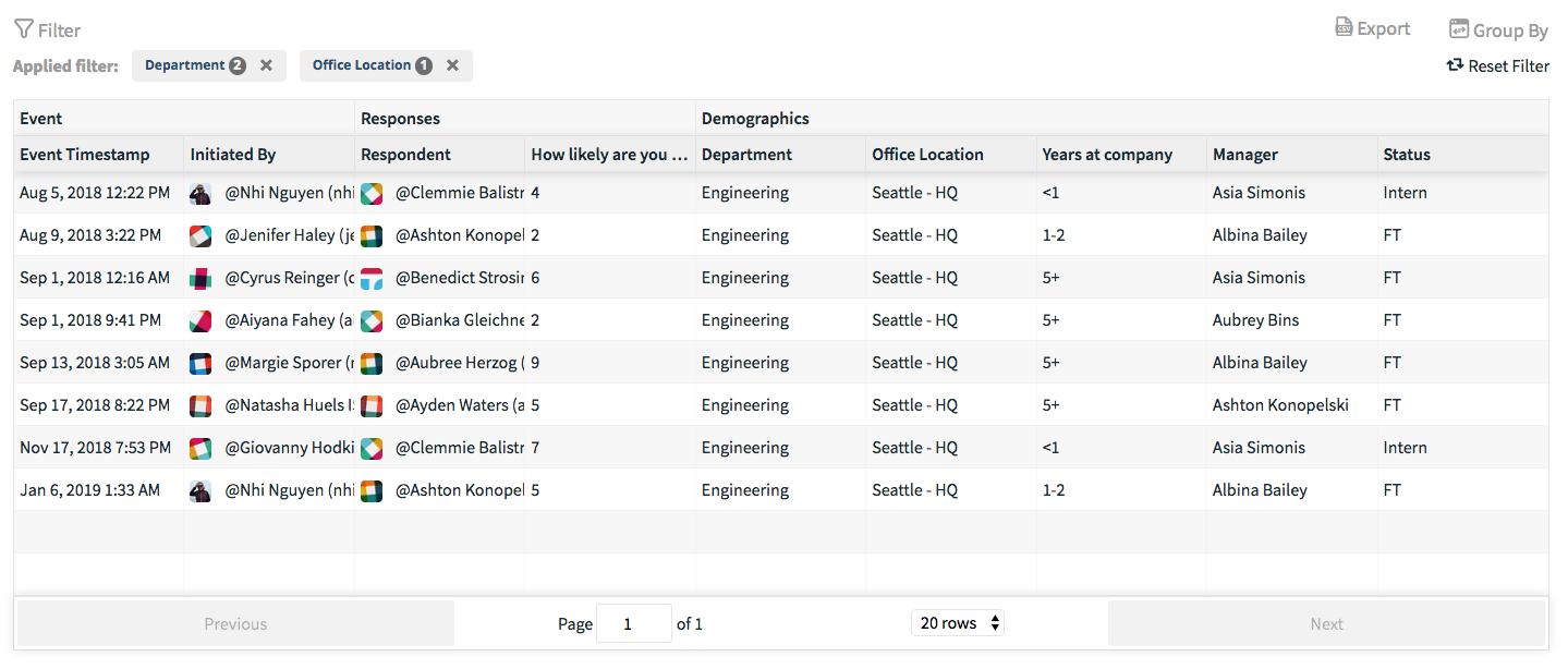
If you have demographic data available, you can also filter to see how certain segments respond to the survey, such as Product and Engineering from the Seattle office.
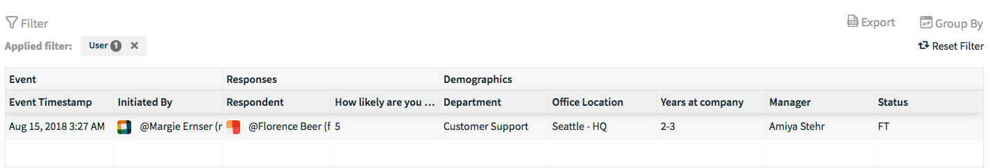
Filter by specific users to see all of their responses to the survey. In the example below, I've filtered out the results to just a single user.
I've grouped the results by the demographic attribute department, so I see how each department responds to the survey. That means for numerical/weighted questions, it will give you the average score for each department.
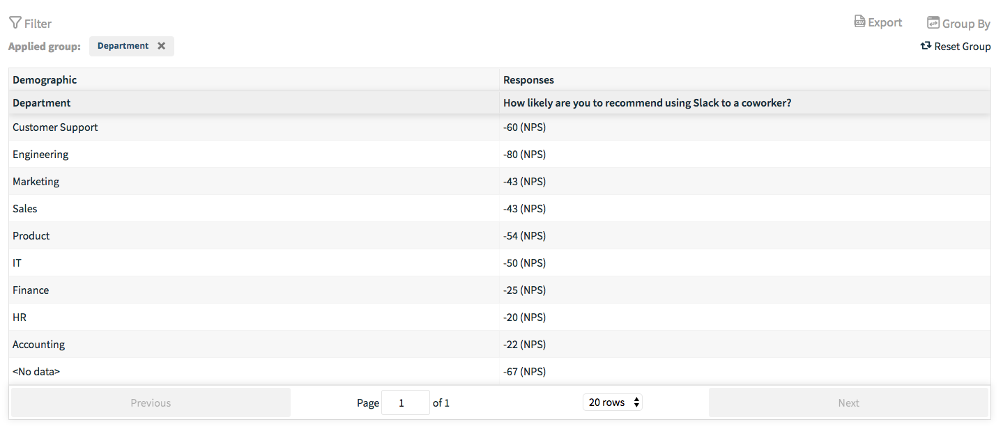
For non-numerical questions (open-ended, multiple choice, etc.) we display results grouped by:
- Numeric: Average Score
- Multiple Choice: List of all choices chosen in this group and their vote totals, sorted by number of votes
- Ranked/Allocation: List of all choices chosen in this group and their point totals, sorted by number of points
- Open-Ended: List of all responses to this question
- Comments: List of all comments for this question
This allows you to group together all the results for a single person in a workflow that a single person may enter through multiple times -- as an example, if you collect feedback on IT tickets in Slack and the same user submits multiple tickets.
And much more!
Exporting your results
From any of the workflow dashboard tabs, you can choose to export your results as a CSV file for your internal reporting and systems.
It's super easy to export your data so you can analyze the performance of your workflow. Armed with this data, you can:
- Combine your workflow results with your own internal user data so you can better understand the impact of the workflow
- Understand how your workflow perform over time
For every type of export that we'll go over below, here's the data that your CSV file will include:
- The trigger and subsequent metadata attached to trigger
- Timestamp, vote ID, survey ID, workflow ID
- Each vote and their comment
- When the workflow was triggered
Exporting from the Question Detail View
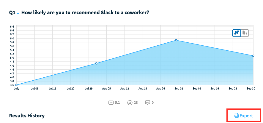
To the right of the Results history, you can export the results for the specific question that you're viewing. You can export:
- All historical data (coming soon!)
- All results within a selected date range (coming soon!)
- The current view
All historical data will give you every response recorded for that question in the workflow's history, whereas if you select a date range, it will only give you the responses to that question within the selected range.
If you've applied filters to get the data that you want, you can export the current view so that it filters out the stuff that you don't need.
Exporting from the Analysis Tab
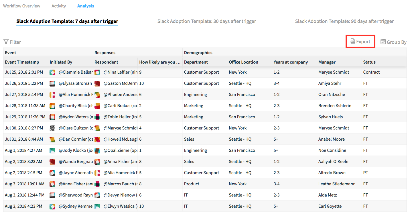
For each survey under the Analysis tab, you have the option to export the following:
- All historical results (coming soon!)
- All results within a selected date range (coming soon!)
- The current view
Although these have the same export options as the Question Detail View, the difference here is that instead of exporting just a single question's results, it will export the entire survey's results (assuming that the survey has multiple questions).
Further insights with exported data
With exporting your workflow results, you can have a better understanding of the performance of your processes and initiatives. For example, you can:
- Pipe this data into a third-party business intelligence tool (such as Tableau, or PowerBI) for a richer, more comprehensive view of your data when combined with other internal metrics that matter most to you
- Understand where areas of your processes are performing well, or underperforming
- and much more!