/Blog%20Featured%20Image%20Icons/visualize-your-data.png)

Introducing historical trends and charts
Measuring trends over time is a crucial part of running any recurring poll or survey – it helps to uncover insights into the effectiveness of your initiative, or the sentiments of your team over time, that you wouldn't be able to see from a single view. It also eliminates the time spent actually creating these charts yourself, when they're readily available within your Polly web app dashboard. Plus, we think the charts and trend lines are visually appealing :) along with making your data more easily digestible, of course.
One of the earliest versions of Polly, the dashboard view was a pie chart by default, and included trend history for recurring polls. When the dashboard v2 (what you see now!) came along, we had to double down on our efforts to bring surveys, templates and more to life so the historical trends and charts went away for a brief period in time.
We're so thrilled to announce that charts and trend history are back and even better than ever before.
How do charts work?
In dashboard view, the default chart that's displayed for your poll summary actually depends on the organization and set up of your poll or survey in question. For the most part, the default for charts is the horizontal bar chart (the one you're used to seeing). The two exceptions for this in default display would be for questions that have more than 10 options, or if it's an NPS question. In those two cases, the default chart type would be a vertical bar.
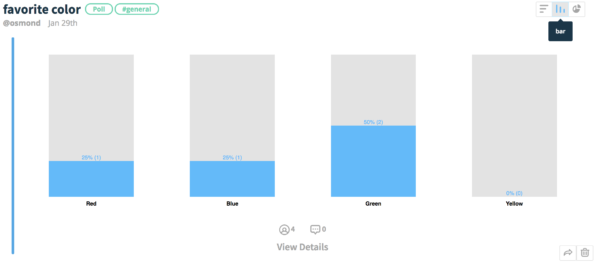
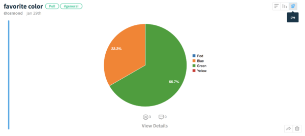
You can easily just toggle the default chart type to something else of your preference in the top right-hand corner of the poll card – if you're really into pie-charts for your data, then pie-charts it is!
How does trend history work?
You can view trend history by clicking into a recurring poll/survey detail view, and it will automatically appear under the question. Quick tip: if you have a lot of types of polls/surveys in your poll feed, you can filter your dashboard to show only recurring polls/surveys :)
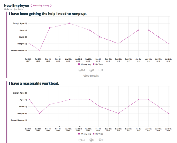
For recurring tracks, it will show the recurring frequency average, where no votes were recorded, and if it's a specific NPS poll, then the NPS score will also be included – just hover over any of the legend options at the bottom.
Note: Charts are available for all Polly plans, but trend history beyond 45 days is only available on one our paid plans. To learn more or upgrade, visit our plans and pricing page.


/Internal%20Comms%20Fun%204.png)